Student: Allegra Milesi
Supervisors: Robin Rehm & Matthias Brenner
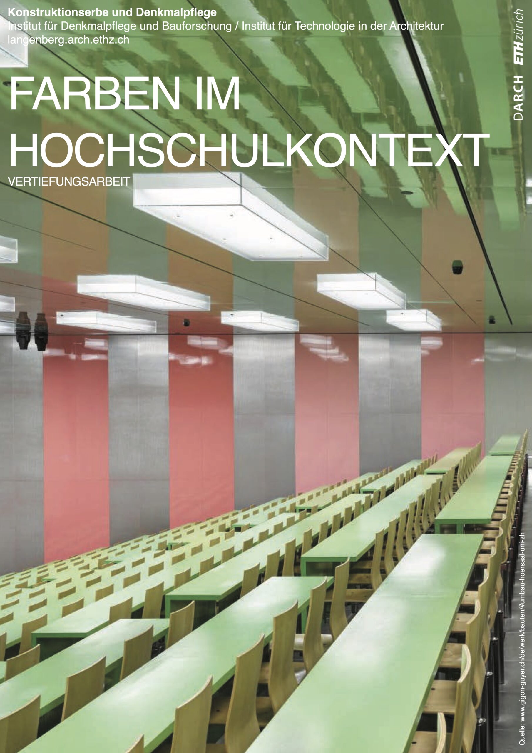
In the context of the in-depth work, it is examined how the bright colors (yellow, red and green) are used in the interiors of the ETH and the University of Zurich. In particular, it is important to investigate how striking and also irritating colors are used. The question is, for example, whether the garish colors are conceptually a deliberate adaptation to our new type of living environment with it’s digital light sources, displays, etc. The question is also whether the colors are used in a way that is not conspicuous. Points of comparison are certain buildings by Herzog & de Meuron, especially the interiors of the university library in Cottbus.